Motivation
Public transportation system can benefit greatly from insights into the traffic volumes. These insights can be helpful in identifying the peak times and peak routes and will be instrumental in effective allocation of buses and other transportation modes to cater those transportation needs. This can further help the authorities in making other corporate decisions such as purchase decisions and decisions to issue route permits (in SL context) etc.
Further, such insights would be used to do demand management. In demand management the user is offered incentives to direct users to use the transportation system when the congestion is less. Airline industry benefits greatly from demand management and this can be applied to other transportation to various extends. To do demand management, insights into the traffic details would be crucial and it can in turn help the authorities of companies identify the effectiveness of such demand management strategies.
Data Set
The data was available from the Open Data Portal of City of Chicago and it included data for both bus and metro lines. The data was in the granularity of days and for buses it had data for each of the bus routes. In the case of metro, the data was in the form of metro station entries. More data was available on bus stops and metro stop. However, these data could not be used for the analysis since the fact tables were in the granularity of bus route and station entries.
The data was in CSV format and my first task was to get them into a relational databases. I did a quick analysis on data in the relational database. Bus rides data had about 700,000 tuples while the station entry data had about 600,000 tuples. I had to derive separate tables for metro stations and bus routes and define required primary keys as well as foreign keys among tables. Since the data was in granularity of days I created a new table for days and added extra columns such as year, month, day of month, day of week which is helpful in further analysis. So my final schema looked like this.
Analysis
For the analysis the preferred BI suite chosen was Pentaho. However, I soon realized the the Community Edition of it lacks much of the ease of use and many things has to be done manually.BI schema
Since time is the major dimension of the analysis I required time to form a hierarchy and designing time in a hierarchical manner was not possible with the schema generation in Pentaho BI server. For that I used the Pentaho Schema Workbench which allowed me to properly mark the dimension and time for the required hierarchy.
OLAP cube
OLAP cubes were generated using the jPivot plugin for Pentaho. Since time was defined in a hierarchy, now I can drilldown the cube in a more meaningful manner (in a year, month, day hierarchy).
Dashboard
The dashboard available in the community edition lacks ease of use and dashboard needs to be defined and the tweaks needs to be done with CSS and JavaScript. So this dashboard creation is not for non-geeks. I included the following charts in the dashboard.
- Bus rides by bus routes
- Station entries by station
- Bus rides and station entries by year (to identify overall trend in public transportation usage)
- Bus rides and station entries by month (to identify seasonal variations)
- Bus rides and station entries by day of month
- Bus rides and station entries by day of week (to identify weekly patterns)
- Bus rides and station entries over time
Reports
Pentaho comes with a report design tool which allows creating report templates and binding data with them easily . I created reports which included total bus rides and station entries by month, year and by station and routes. Report Designer allows publishing those reports to the BI server. However, I got an error while doing so. Though I did not find any documentation to suggest that, I suspect this is not allowed in the community edition. Report designer allows publishing reports in multiple formats and the following is a sample report in HTML format.
Observations and Interesting Findings
A number of interesting observations were made using the Pentaho dashboard.
There is an year by year increase of metro usage while the usage of buses remained constant over the course of 13 years.
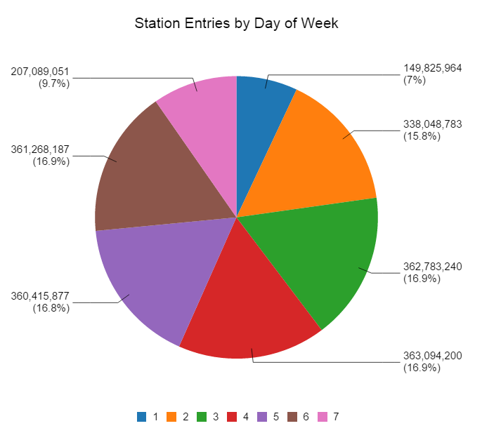
As expected, Sunday recorded the least usage of public transport followed by Saturday. However, interestingly Monday had a noticeable drop compared to other week days. May be people feel lazy to wake up on Monday mornings and rush to work with their own vehicles :)
Moreover, interesting seasonal variations were observed which is suspected to be related to four seasons. There was a noticeable drop in the public transit usage in the months of December, January, and February and this is possibly due to the winter conditions.
Further I noticed that some days in the month has considerable less usage. In the below graph 31st day of the month record lowest since not every month has a 31st. The drop in 29th and 30 the can probably be asserted to the month of February. Drops on 1st, 4th and 25th can possible be due to US holidays that falls on fixed days (1st Jan - New year's day, 4th Jul - Independence day, 25th Dec - Christmas day). However, I did not find such a drop for 11th Nov which is the Veteran's day.


This comment has been removed by a blog administrator.
ReplyDeleteThis comment has been removed by a blog administrator.
ReplyDeleteThis comment has been removed by a blog administrator.
ReplyDeleteThis comment has been removed by a blog administrator.
ReplyDelete